> ## Documentation Index
> Fetch the complete documentation index at: https://docs.cloud.cdata.com/llms.txt
> Use this file to discover all available pages before exploring further.
# Dashboard
> The ***Dashboard*** page provides a high-level overview of recent queries and account activity for a particular account. It can also provide an overview of all your sub-account activity.
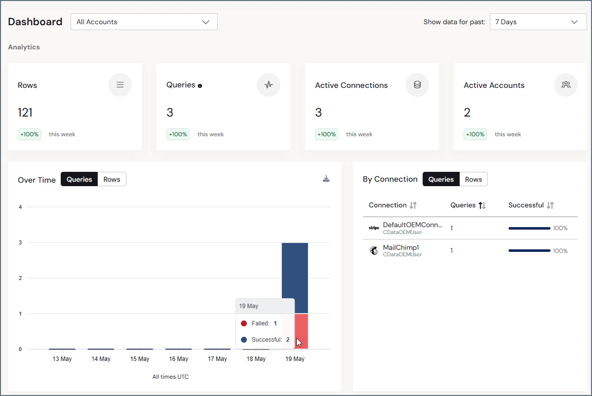 The drop-down list next to **Dashboard** allows you to view the dashboard for a single sub-account, or for all accounts.
The upper-right corner of the page displays buttons to adjust data for the past **1 Day**, **7 Days**, and **30 Days**. Clicking one of these buttons refreshes the page and adjusts the displayed data accordingly.
## Information Boxes
Information boxes at the top of the page display the quantity for each of these four categories in the selected time period:
* **Rows:** The rows that are processed
* **Queries:** The queries that are performed
* **Active Connections:** The active connections on your account
The drop-down list next to **Dashboard** allows you to view the dashboard for a single sub-account, or for all accounts.
The upper-right corner of the page displays buttons to adjust data for the past **1 Day**, **7 Days**, and **30 Days**. Clicking one of these buttons refreshes the page and adjusts the displayed data accordingly.
## Information Boxes
Information boxes at the top of the page display the quantity for each of these four categories in the selected time period:
* **Rows:** The rows that are processed
* **Queries:** The queries that are performed
* **Active Connections:** The active connections on your account
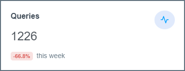 Underneath the count, each box displays the percentage change compared to the previous time period. This percentage change adjusts dynamically based on the time period that is selected.
## Data Visuals
Under the information boxes, the **Dashboard** page displays two visuals:
* **Queries/Rows Over Time**
* **Queries/Rows by Connection**
### Queries/Rows Over Time
This bar graph shows the total number of queries or total rows returned in the sub-account over the selected time period. The x-axis displays the dates, and the y-axis displays the number of queries/rows.
Underneath the count, each box displays the percentage change compared to the previous time period. This percentage change adjusts dynamically based on the time period that is selected.
## Data Visuals
Under the information boxes, the **Dashboard** page displays two visuals:
* **Queries/Rows Over Time**
* **Queries/Rows by Connection**
### Queries/Rows Over Time
This bar graph shows the total number of queries or total rows returned in the sub-account over the selected time period. The x-axis displays the dates, and the y-axis displays the number of queries/rows.
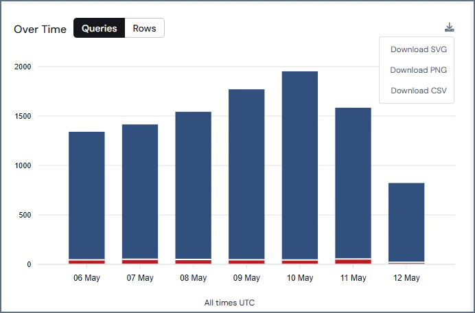 Each bar is composed of two sections:
* The number of successful queries or rows returned, displayed top portion of the bar and colored blue
* The number of failed queries, displayed as the bottom portion of the bar and colored red
Clicking the down arrow icon in the upper-right corner of the section opens an export menu. This menu enables you to export the graph as a data file.
### Queries/Rows by Connection
This table displays the number of queries or total rows by each connection in the selected time period.
Each bar is composed of two sections:
* The number of successful queries or rows returned, displayed top portion of the bar and colored blue
* The number of failed queries, displayed as the bottom portion of the bar and colored red
Clicking the down arrow icon in the upper-right corner of the section opens an export menu. This menu enables you to export the graph as a data file.
### Queries/Rows by Connection
This table displays the number of queries or total rows by each connection in the selected time period.
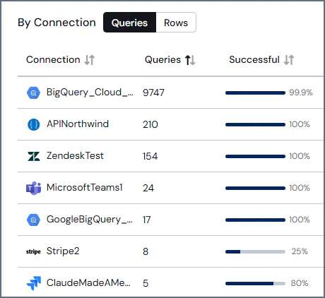 There are three columns in this table:
* **Connection:** The name that is given to the connection on the **Connections** tab
* **Queries:** The total number of queries, both successful and failed, that are made by the connection in the selected time period
* **Successful:** The percentage of queries from the connector that succeed in the selected time period
Clicking the name of a column sorts the table by that column. If the table is already sorted by the selected column, the sort function toggles between ascending and descending order.
This documentation is built and hosted on [Mintlify](https://mintlify.com), a developer documentation platform.
There are three columns in this table:
* **Connection:** The name that is given to the connection on the **Connections** tab
* **Queries:** The total number of queries, both successful and failed, that are made by the connection in the selected time period
* **Successful:** The percentage of queries from the connector that succeed in the selected time period
Clicking the name of a column sorts the table by that column. If the table is already sorted by the selected column, the sort function toggles between ascending and descending order.
This documentation is built and hosted on [Mintlify](https://mintlify.com), a developer documentation platform.